

Teaching spatial computing
My Impact
My UX writing and content strategy are high-priority and highly visible, reaching all headset users.
My Role
Content strategy from first touch to first game. My goal is to guide users through their device experience in a clear and intuitive way, encouraging frequent and confident use.

The Opportunity
Shaping the learning journey for new and existing Meta Quest headset users with the most significant update to the Horizon OS user interface in 5 years!
My Product Team
Product Designers
Art Directors
User Researchers
Software Engineers
Product Managers
Data Scientist
Internationalization / Localization Team
Sound Design / Voice Talent
Problem to solve
Our current methods of interacting with digital devices follow predictable and well-established patterns. With spatial computing in a virtual reality headset, the users engage directly with their environment in dynamic and immersive ways. While this opens up exciting possibilities, it also introduces new behaviors that require basic skills education to fully understand.
Interactive tutorial
The Meta user research team has shared that research participants think a mix of upfront, interactive training and contextual education could improve their headset experience. Agreed!
For many, the first time they put on a Quest headset is their first experience with virtual reality, whether for gaming, work, play or were offered one as inflight entertainment. By teaching them the basics they can be confident and have an enjoyable experience.
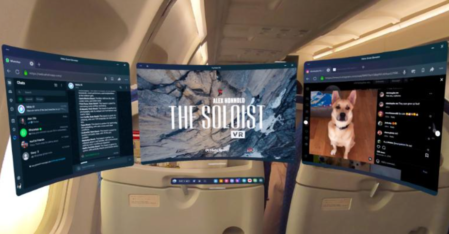
(Lufthansa)
Deciding which features to teach in onboarding
All users will see this content so the onboarding tutorial should cover education that is:
Crucial: Users need to know to effectively use their headset.
Universally relevant: Will be useful to the vast majority of, if not all, users.
I make sure to provide users with a foundation by teaching system basics before introducing them to more complex device features and functions. Those are taught after onboarding in contextual education.
We balance in the most concise way possible both teaching users about the basics of how to use the headset but also introducing them to how the Metaverse works.
Feedback guiding decisions
My product team continuously integrates user research, new features, and business requirements into onboarding tutorials. We also gather feedback from internal testers and teammates throughout development.
As the Content Designer, I incorporate leadership feedback—which takes priority—and either adjust the content accordingly or explain when a different approach is more appropriate, based on prior research and rationale.
I also helped define the overall narrative direction of the tutorials.
Voice and Tone
Persona’s tone range
In the onboarding tutorial I mostly use the following three tones.
CELEBRATORY TONE:
Goal: Recognize positive moments. This tone is useful when you want to bring people together without expecting action.
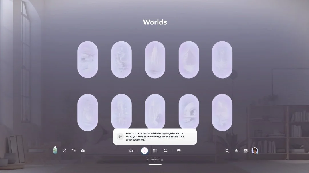
Sample line from script: “Nicely done! Now you know how to control your experience using the Navigator!”
Objective by prompting this line for user: User should be reassured that they took a step properly.
INSTRUCTIVE TONE:
Goal: This tone is useful when you want to tell people what they need to know or do in a moment in simple, clear language.
Sample line from script: “You can also use your hands. Look at your right palm at eye level and tap your thumb and index finger together.”
Objective by prompting this line for user: User should be able to follow this instruction to open the Navigator using hands instead of controllers.
SUPPORTIVE TONE:
Goal: Reassure people when they need guidance. This tone can help us address people’s concerns or fears and help them move forward.
Sample line from script: “Press the Meta button to start exploring with the Navigator, which is always here to help you find what you need.”
Objective by prompting this line for user: User should understand that the Navigator can be summoned any time they need something.
Working within Meta’s voice and tone standards, the “Big-Hearted Nerd”, words selected has to be simple, straightforward and human.
Words also have to bring an element of delight. Research determined users appreciated a congratulatory message when completing tasks so some “good job” and “well done” messages were included when appropriate. (Some of these were removed from this version last minute based on feedback that a few screens can be progresed without completing the action requested so it didn’t feel correct to tell the user “Good job!” for only pressing the next arrow.)
Persona
The persona is a friendly but self-aware big-hearted nerd. They guide the user through the experience. They don’t refer to themselves or speak in the first person. They are disembodied, mostly providing instruction, guidance and encouragement to users as they onboard and navigate the system. (Per our brand voice, by “nerd” we mean someone who exists at the intersection of passion and knowledge — the persona believes in our amazing technology and can’t wait for you to explore and experience the magic for yourself.
The persona relates to the user like a friend taking the user through an exhibit. They’ve been here before and are excited for their friend to experience the magic of it all, too. They know what’s coming, but they’re not going to spoil it or overhype it.
Voice Principles
Be conversational.
We want to share this awesome experience with a companion going through it for the first time — it’s guiding them through, not narrating “to” them.
Be confident.
We know what’s coming and know it’s gonna be great. But, we’re not going to spoil anything.
Be enthusiastic.
We love this and we’re genuinely enthusiastic about sharing this experience.
Be open.
When we speak, we use clear and accessible language so everyone feels welcome. We invite and expect others’ ideas and input.
Be optimistic.
When we speak, we’re honest, clear and hopeful about the future. You can feel the positive energy in our voice and actions.
Be self-aware.
When we speak, we’re mindful of what they say and how they say it. We know when to laugh, when to be serious and when to poke fun at ourselves.
Cross-functional partner collaboration
I collaborate closely with my product team throughout the week, contributing to various aspects of the tutorial project. User researchers regularly conduct in-person studies, providing valuable feedback that helps me refine content based on real user insights.
I help shape the end-to-end tutorial flow through constant communication and collaboration in tools like Figma, Google Docs, Workplace Chat, and virtual meetings. Figma is used company-wide, allowing me to tag fellow Content Designers and cross-functional partners for input and clarification as needed.
Because the product space is still evolvin, with many features yet to be name, I work with other Content Designers to align on terminology and messaging. I also proactively connect with teams across the organization to ensure the tutorial reflects accurate and up-to-date information.
I create content iterations in Figma and review them with stakeholders, including fellow Content Designers and other decision-makers, to ensure alignment. We also present our progress in weekly leadership meetings for alignment to keep moving forward.
Product Design begins with a new Figma file for each release. I partner closely with the Product Designer and User Researcher in working sessions to review each screen, integrate research insights, and explore ideas, questions, and user needs.
As the Content Designer, I lead the narrative strategy ensuring clarity at every moment in the flow. I iterate directly in Figma using Meta Content Design standards and regularly review my work with peers to ensure alignment.
While I'm empowered to make final content decisions, I collaborate with the necessary Content Designers and cross-functional teams to ensure consistency in voice, terminology, and instructional accuracy.
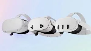
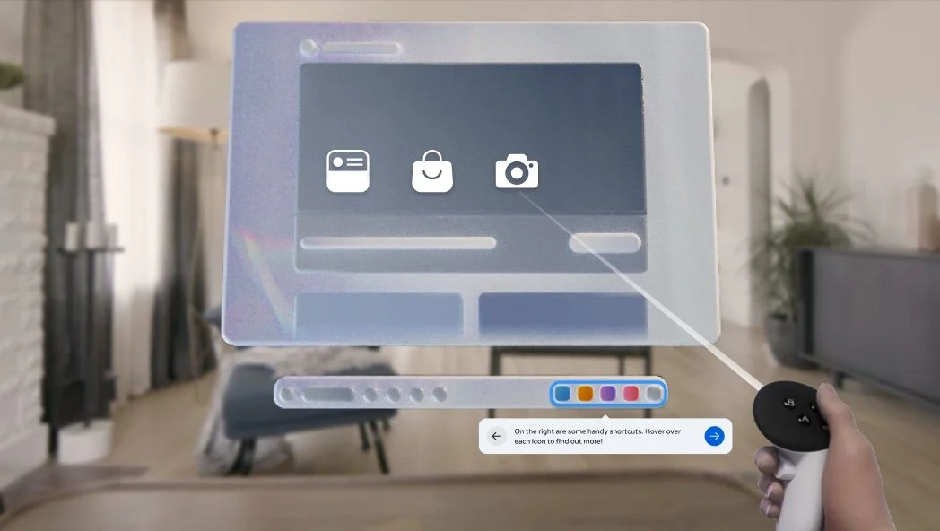
The Navigator onboarding tutorial
New spatial user interface - the Navigator
Public release May 2025
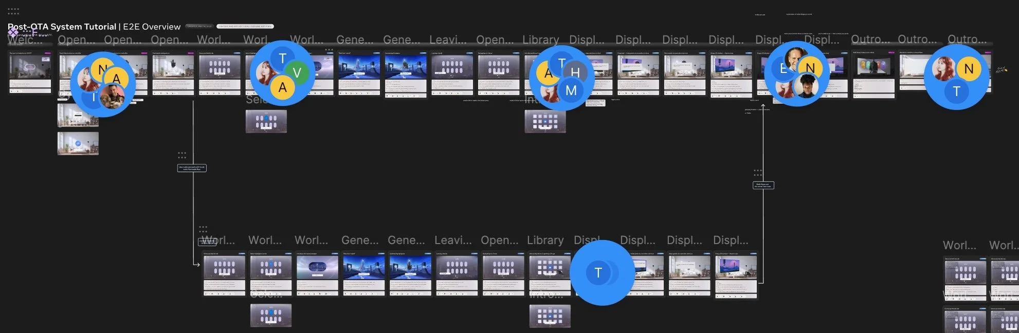
Here is a link to images of my Figma files that I worked on and polished over many iterations.
Old panel user interface
As I mentioned my team is continually iterating on our work based on feedback from User Research and new business needs. The past 9 months we’ve been working on the onboarding for the most significant update to the user interface in 5 years.
As a team we were tasked with teaching how to use the new user interface, the Navigator, in a delightful way. The metric my team works towards is increased tutorial completion. We also look at the number of active users in their first 30 days of ownership. Our assumption is if we can teach users basic skills to use their headset and help them find use cases (help them discover what drove them to buy the headset in the first place) they will be likely to continue using it within that first month.
Localization, Sound Design & Accessibility

Voice actor recording session
Once product managers define business requirements, the team aligns on a schedule based on engineering release dates. Then I create a workback plan for content deliverables. For our tutoria, which includes voice-over (VO) and supporting toast, I coordinate with Sound Design and Localization to ensure VO lines are recorded, translated, and delivered to Engineering in time for prototype testing.
I lead coordination of language management and translation efforts. Once the content and script are locked, I provide a line sheet to translators and Sound Design.
Two weeks is a long time in a fast moving company
We use human voice talent so the recording process involves scheduling, directing, and mixing, typically taking a few days. These English VO files are then sent to Localization to guide translations, which can take up to two weeks.
In some cases, last-minute changes have required us to release an English-only version to a limited audience, with translations added in a fast-follow release.
Content suddenly outdated as the UI is being built
Since the UI is still under development and released in phases, content can become outdated with the time it takes to record and translate. For a recent high-priority release, leadership asked us to skip the scheduled launch and fully rebuild the headset tutorial to reflect the latest updates.
Throughout the UX writing process, I proactively consider localization needs—ensure that the longest translated versions will still fit within design constraints and translates cleanly, while incorporating thoughtful, engaging expressions where appropriate.
As a general guideline, I aim to keep English copy within three lines on a pop-up toast, knowing that translations and increased font sizes may push it to four. This sets clear limits on character count and ensures the tooltips remain usable across all languages and accessibility settings.
Final product
My team completed multiple versions of the tutorial, with some not released due to delay over the overall project or last minute leadership pivots. The Navigator project was on internal “lockdown” and certain requirements needed to be met for the lockdown to be lifted. In early May the lockdown was lifted and by then more progress had been made on the project so we did another round of content changes and voice over recordings. This release is due to go out to only a small number of English speaking users so there wasn’t the same time needed for localization.
It was released to a Public Test Channel in May 2025 and will be progressively released until a full release later in the summer.
User flow from first use:
After unboxing, the user puts on the headset and presses the power button. They see six static, factory-loaded screens unchanged across OS builds. Once connected to Wi-Fi, the headset downloads the latest OS while setup continues on the user’s mobile app.

As a Content Designer on my product team, my role follows a “hub and spoke” model. I collaborate with many teams across Reality Labs and Meta. While my product team owns the end-to-end flow, we partner with eight or more feature teams responsible for specific screens.
For example, I work closely with the Account Setup team on the first three screens below. They inform me of any updates, and I adjust content as needed to fit our onboarding flow. I also attend leadership reviews and user research sessions when some feature teams aren’t present, relaying feedback directly to the Content Designers on those product teams.
The screens I’ve outlined in red are specifically owned by my product team and content is entirely up to me.

The user proceeds through consent and payment setup as seen below. The final screen offers optional accessibility settings. Once the OS update is complete, the user is prompted to put the headset back on.
After the more task-heavy steps, this screen is an opportunity to build excitement for what’s next. If accessibility is enabled here, it applies in-headset. I also collaborate with the Accessibility team on this content.
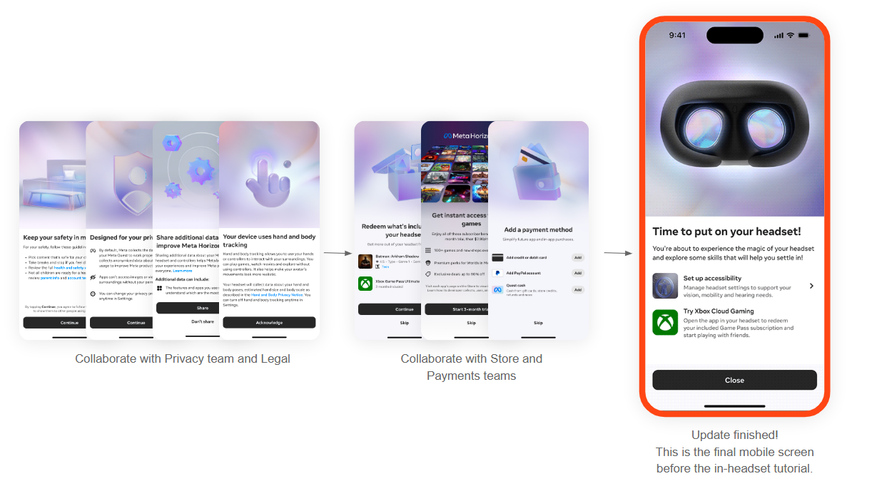
Finally the user places their headset back on to be greeted by an animated welcome button. Then the interactive tutorial begins. The video below is an engineer’s demo video but mostly captures the experience.
Public feedback of the tutorial has been positive. One reviewer specifically called out the education new user tutorial as “worth watching even if you’ve used a Meta Quest headset before”.
Outro video
After the tutorial, we show a 30-second video designed to inspire engagement by highlighting the range of experiences possible in the headset. A previous version was well-received in user testing, and its release correlated with an increase in Monthly Active Users. However, the use cases in that video are now outdated, so I partnered with the Art team to create a new version for release later this year.
As a team, we aligned on key themes—media, productivity, fitness, social connection, and shared experiences in immersive worlds, games, and events. I developed several content options and finalized the script as seen below. The previous video included long paragraphs of on-screen text; this time, I kept messaging short to avoid distracting from the visuals. We’re still evaluating whether voice-over will work, as syncing it with visuals across multiple translations could be challenging.
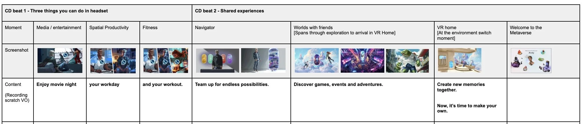

Key educational beats in storyline I worked with to create the content.
Current version (June 2025)
Next steps
For the next iteration, it would be helpful to create a separate basic skills module for beginners and a “what’s new” module for experienced users. Breaking skills into individual modules would also let users choose what to focus on and what to skip.
The next version of the tutorials is already well underway.